Optimise email signatures for dark mode

Many users enjoy the flexibility to customise the user interface according to their preferences. A relatively new user interface design that is gaining popularity is the dark mode. It is now available on most software programs on various devices. This feature allows the user to partially invert the screen.
A dark mode device displays a dark gray background and white text instead of the white background and black text of a standard program. Images are usually displayed unaltered. Dark mode helps extend battery life and reduce glare. In addition, many people prefer this mode to lessen eye strain in darker environments.
What are the challenges for email signatures in dark mode?
What back then was still untapped territory is nowadays part of everyday working life for many: using dark mode on all programs where possible, even with email clients like Microsoft Outlook. So, you send a classic black-on-white email, but the recipient, who has activated the dark mode, often sees it differently than you do. This means that anyone writing an email should take into account how their design will be seen when displayed in dark mode.
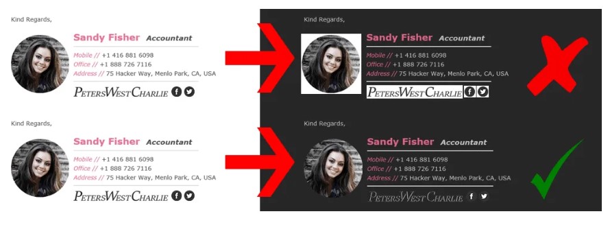
Design elements such as links, logos, different colors and fonts present the biggest challenge when converting from light to dark backgrounds. In fact, if they are very dark and are not outlined with a light border, for example, they might even become invisible. Furthermore, transparent logos (especially with dark elements) may disappear or be covered. When using logos with a white background, make sure that they are surrounded by a white frame.
Signature rendering is not always within our control because: Email client developers did not originally design their products with dark mode principles in mind. Therefore, the automatic “improvement” is only subjective and often leads to wrong representations.
Source: Gimmio
Get consistent signatures across your organisation and reduce workload with an automated and centrally managed solution. Our Disclaimer & Signature Management solution iQ.Suite Trailer offers you even more than that.
Tips for optimising your email signatures for dark mode:
1. Don’t rely too much on background colors.
Background colours are usually inverted by the email client. Results can occasionally be unpredictable, as email clients can react very differently depending on the background color used and how bright or dark it is. It may be wise not to rely on a background color if you want predictable results.
Setting your entire signature as a single image is also not advisable. Even though it makes your email signature more consistent, it brings too many problems. In addition to the white frame/box around the signature, it makes almost all links unclickable as only one hyperlink can be added per image at a time. Since images are often sent as attachments, your signature may disappear in some email clients.
2. Keep an eye on the colors of your text.
Keep in mind that colors that are too bright or dark are likely to be inverted on a dark screen. This means that your company’s brand color may disappear or change. Some email clients are smart enough to determine whether a color should be inverted based on the contrast ratio and background color of a section. Others simply invert the color they encounter regardless of the background.
3. Pay attention to your logo and other images.
In general, we advise you to use a transparent background for your logo (PNG, not GIF). This way, the white outline visible in dark mode is removed. The problem with logos with black or dark font is that these components – often the company name – are lost or covered by the background. Choose a logo version with the boldest possible color tones that will look good on both bright and dark backgrounds. If that’s not possible, consider adding a white stroke or glow around black text or elements.
On a white background, this bright glow would not be noticeable, but on a dark background, black characters would be more visible because of the bright outline. Since you as the sender cannot know whether your recipient is using a dark mode, you cannot adjust to it individually. Unfortunately, the e-mail clients also do not support alternative image resources, which are only used for a dark mode.
Some email clients support the automatic display of different images, others do not. For instance, our solution for disclaimer and signature management, iQ.Suite Trailer, supports this feature.
In the following example code snippet, the element “dark.png” is automatically used in dark mode instead of “light.png”:

Our icons have been uploaded in .png format. For this purpose, their background is transparent (except for the border). This transparency allows a clean conversion to dark mode without looking particularly garish:
Our logo in bright orange is clearly legible in both versions. Just like the icons, the GBS lettering also has a white border and is transparent.
Email signatures complete the brand image that the company conveys through its communication to the outside world. Whether it is managed manually or through a solution, it should be treated like a business card and made as consistent and accurate as possible.
iQ.Suite Trailer is a disclaimer and signature management solution that is centrally managed and automated to ensure uniform and compliant management of your signatures and to support your email signature marketing.
Feel free to contact us if you have any questions!
Author: Anya Raider


